Integration Marketplace
THE GOAL
Creating an ecosystem of integrations around Lucid’s core products to empower customers to seamlessly connect their favorite software without ever leaving the product.
MY ROLE
Lead Designer
User Experience
Visual Design
Usability Testing
TOOLS
Figma
The Story
The Integration Marketplace was envisioned to centralize information and help audience’s explore Lucid’s broad arena of 1st and 3rd party applications. It was a marriage between the public and in-app experience.
The need for the Marketplace stemmed from somewhat scattered information about the integrations and extensions that were supported. These inconsistencies came to a head when 3rd party built experiences were available for our product, at scale. We needed to consolidate our artifacts and showcase our depth as a leading Fortune 500 company.
Beyond the primary goal, sights were set on making it an extensible platform so that developers were also able to introduce new features.
Audience + Early Tests
The Marketplace being a public and in-app experience meant building for a wide audience: acquainted and unacquainted customers.
I came to define acquainted customers as those familiar with Lucid’s product suite and looking for alignment. Unacquainted customers were defined as new to Lucid’s product suite, or looking for reasons to switch from their current software. Both groups could be further broken down into authenticated and unauthenticated experiences.
Using these definitions narrowed down the scope and how to pursue research.
Six moderated studies of users aged 23 - 45 showed that 52% of their time was spent searching for the correct integration. The following 37% of their time was spent digesting information about that integration. From this analysis, I began designing the solution.
Ideation Phase
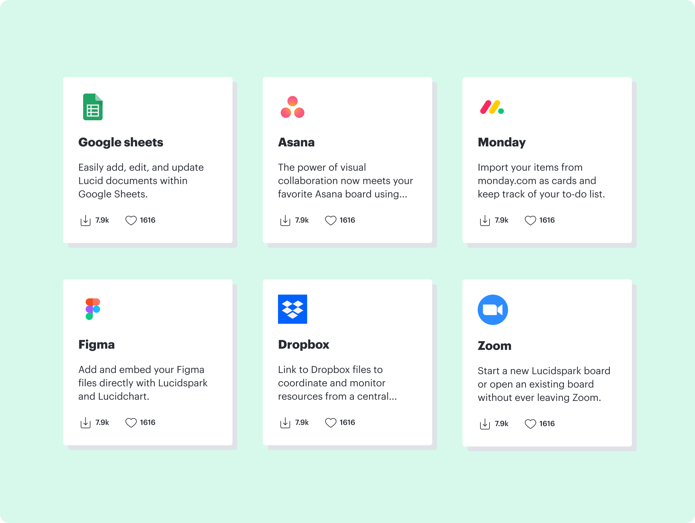
A prototype emerged to address the marketplace experience. Using staged disclosure, users could select a card to be directed to that particular integration’s listing page to learn more.
Usability testing on this early design presented insight that users had difficulty identifying important information about a listing from the card on the catalog page. Users were looking for at a glance information about the product.
The second prototype of the cards yielded better results and resolved pain points from the first round of testing. The product logo moved to the top left corner and three lines of copy were included to supplement the card.
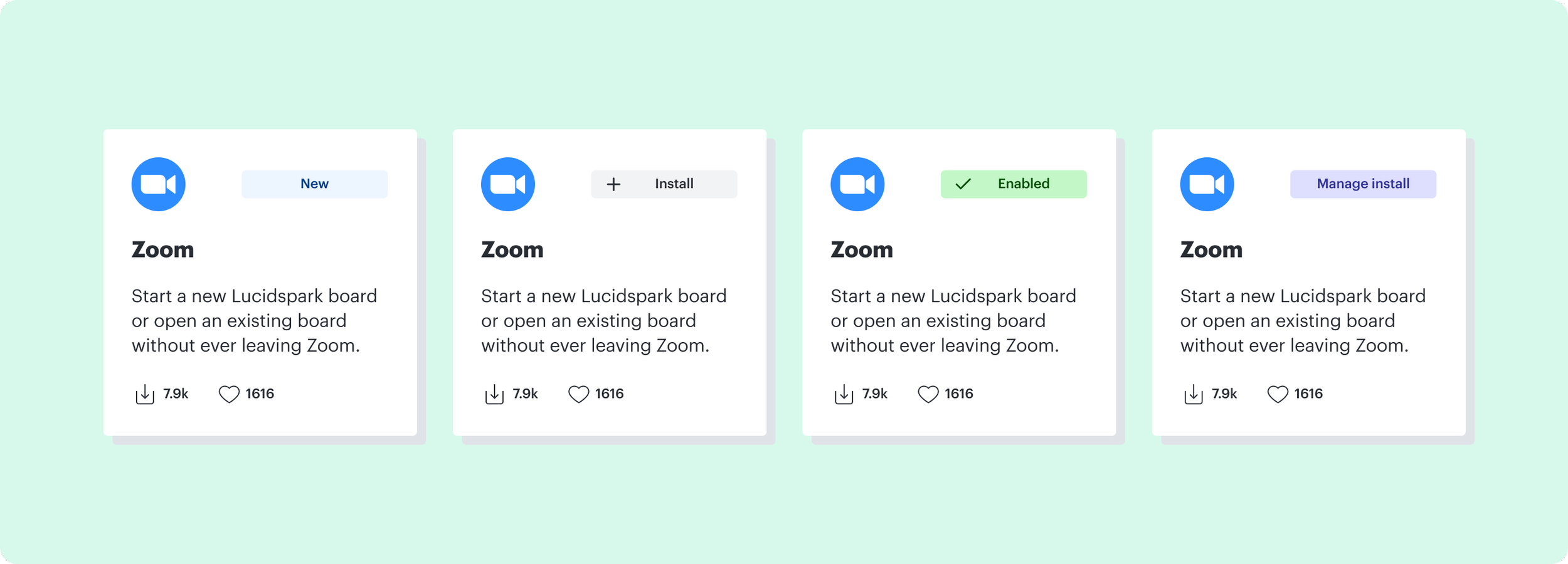
The second chain of tests surfaced an important discovery. Users needed to be able to distinguish whether an integration had been installed. It saved time and effort on the customer’s part to have the information up front on authenticated experiences.
The solution to the problem was introduced through a series of indicators located on the card. On the unauthenticated experience, new integrations carried a “new“ label. On the authenticated experience, users were met with four labels: install, new, enabled, and manage install.
Having indicators on the cards created a streamlined experience for both groups of users and mitigated search efforts. Card indicators introduced scalability further down the road.
After discussing with stakeholders, feedback arose that it may be worthwhile to include “by Lucid“ on each card. While there wasn’t a strong argument towards it, ultimately a third round of testing determined the card design. Participants were able to choose from the three options below.
Test participants confidently axed Option A. Introducing “by Lucid“ on the cards was unnecessary since all the integrations minus a select few were made by Lucid. While Option B and C performed well, Option B was sidelined on account of a lack in tracking data. Option C became the clear winner.
On the catalog page the only other element to drop was filtering by product. It added an unnecessary layer of complexity since the side navigation had already adjusted to include filters. And with that, the final catalog design came into view.
After the catalog page and card designs were completed, the last task remaining in the marketplace experience was the listing page.
The listing page served as a “jumping pad“ for users to enter the product and test out the integration. The page needed to highlight key information, Lucid product integrations and an image carousel. Pretty easy, right? Surprisingly it was.
Only two designs were created for the listing page and of the two, Option B proved to be the preferred design. Participant feedback specified Option B as straightforward and easy to digest. Having a carousel of images further helped customers visually connect with the integration.
What did I Learn?
The most important finding was the synergy needed to make a new company venture work. What initially started as a one man job quickly turned into a 41 person team strategy. The marketplace needed to accomplish business goals and maintain its appeal to a variety of users. This facilitated a need for job stories over personas. Causality, motivation, and context brought the project to life.
The Team
The marketplace involved a variety of stakeholders and teams. Giving a special shout to the Project Management Team, Product UX Team, Brand Design Team, Product Marketing Managers, Content Team, and many executives.


