Light Up
OVERVIEW
Light Up is a vocabulary learning app that was built as part of the UX Fundamentals course within CareerFoundry. Here you will find my research and design thinking process.
MY ROLE
UX Research
UX Design
UI Design
TOOLS
FlowMapp
Figma
Adobe Illustrator
Marvel
Problem Space
How can we create a mobile app that will inspire people to learn new vocabulary? Mastery of a discipline requires time, patience and effort; and users can find it difficult to ascertain progress when studying. Light Up bridges the gap between all three.
Research Phase
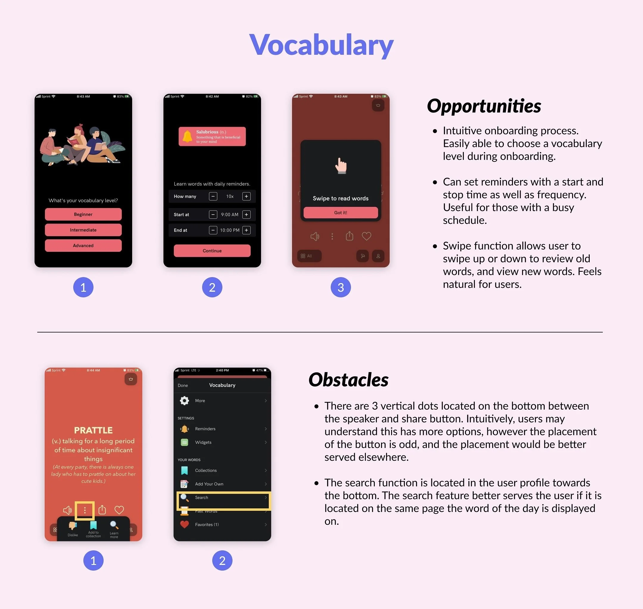
During the discovery phase, I analyzed three top competitors to get a better understanding of what Light Up was up against. This was imperative to identify threats, strengths, flaws and opportunities.
The three competitors analyzed were Word Up, AnkiApp and Vocabulary.
User Interviews
With a script and pertinent questions prepared beforehand, I set out to conduct a series of user interviews. These interviews were conducted in person to identify pain points and user needs within the app.
The notes were categorized into Doing, Thinking and Feeling statements.
The interviews yielded interesting results.
Notifications - A visual reminder on their phone.
Synonyms - Having synonyms associated with the word of the day. This would develop word association and help with learning and memorization.
UI - A clean look and aesthetic to make the app easy to navigate.
Examples - Multiple ways to learn a word. Including images, audio, synonyms, example sentences.
Engaging - Have the ability to connect with other users through playing games to test knowledge.
Proto-Personas
For the sake of the project, proto-personas were created due to timing constraints. Based on the user research I collected - the proto personas integrated the discoveries and feedback learned to understand the user’s needs.
Each proto-persona contained a problem statement and a hypothesis statement.
Problem Statement - Alex needs a way to maximize his time spent learning so he can employ his knowledge with stakeholders at his company. We will know this to be true when he successfully keeps client relations moving forward.
Hypothesis Statement - We believe that by creating a solution that can group words based on similarity, we will maximize the time Alex spends learning so that he can employ this knowledge in the workplace.
To aid the statements, user stories and job stories were developed to create real scenarios where a user would employ the app.
User Flows + Task Analysis
User flows were developed in response to the proto-personas that were created. This was essential in understanding how users would navigate through the app. Two user flows were created for this step.
Primary Task - Complete an assessment quiz to customize vocabulary words shown to user.
Secondary Task - Complete an immersive game that tests knowledge and keeps user engaged.
Wireframes + Prototyping
Wireframes were produced to map out the user flows. These are low level rapid sketches of the Primary and Secondary tasks.
Primary Task - Complete an assessment quiz to customize vocabulary words shown to user.
Secondary Task - Complete an immersive game that tests knowledge and keeps user engaged.
These wireframes were then translated into Marvel.
Testing
Three usability tests were conducted spanning 10 minutes each. These were held individually and the user was instructed to complete 4 tasks. The tasks were:
Explore the Application
Play a Game
Save a Definition
Add a New Word
After the usability tests had been conducted, I rated the severity of the issues on the Jakob Nielsens error severity scale.
The usability tests were very beneficial. They enabled me to address key issues in the app.
Video Game Icon - Not each user understood the video game icon that I had used unless they had previously been introduced to gaming.
Value Proposition - Many users stated they were looking for some sort of value proposition.
Mastery of a Language - Users stated that they didn’t know what true mastery of the English language equated to. For example, someone could be versed in the language associated with housing materials, but not understand the language within the medical field.
Heart Icon - Users thought this icon meant they liked a word, not that they could save a word to review later.
Saved Words - Two of the users intuitively understood that when saving a word it would go into a specific collection. A feature they wanted to see was if when the word popped up on the dashboard; there could be some sort of feature reminding the user which collection the word was saved in.
Reminders - There was no notification feature built into the app.
Assessment Screen - Users had trouble understanding if the assessment was necessary, if they could reassess at a later date, and when the assessment was completed during onboarding.
Touch-upS
Borrowing my findings from the testing, I made refinements to the wireframes.
Introduced Value Propositions - I added a value proposition to the splash screen to retain users.
Language Familiarity - I removed ‘Mastery‘ and ‘Advanced‘ from this screen and replaced them with ‘Fluent‘ instead.
Assessment pages - I added clarification to the assessment page and an additional screen to notify users that the assessment had been completed, after which they could create a profile.
Video Game Icon - I removed the icon and replaced it with game dice. Much more intuitive for users.
Star Icon - The heart icon was removed and replaced with a star icon. This made more sense for users that were saving a word to a collection.
In The End
Cue the Linkin Park song.
Developing Light Up was a thrilling experience. It illuminated the many ways a solution can come about and how designers can bring immeasurable value through user experience.
My plans are to develop my designs and launch an app for iOS and Android.


